
I say part one only because I have a fair amount of miscellaneous photos with very little overall theme to tie them together. But since you’re ‘there’ and not ‘here,’ I expect photos would be of great interest (pictures, thousand words, etc.).
But before we get to the gallery, a few words (and examples) of the great language divide as told through the humble T-shirt slogan. At the start of a recent Japanese language lesson, my instructor told me she was concerned because she had seen a sign at the train station in both English and Japanese, and that the English translation was terrible.
She realized that most Japanese would not know enough English to care, as the Japanese version was correct. Her concern was more a point of pride. With the Olympics coming to Tokyo in the Summer of 2020, she was concerned that native and proficient English speakers would have a poor view of Japan if they couldn’t even get simple signs translated properly. Indeed, for the past few years there has been an effort to include more English signs in many places, especially public transportation. We have been the unintended beneficiaries of this effort and it is very helpful.
As one wanders the streets in this bustling town, there is a bombardment of signs, logos, loudspeaker announcements, etc., about 99% of it in Japanese. As such, to a non-Japanese speaker, it is a bit like white noise; you see it and hear it, but it tends to just wash over you. On the other hand, when something is printed or spoken in English, it sticks out and tends to be noticed. Enter the lowly T-shirt, the canvas of the masses.
Many of these shirts are standard-issue stuff, logos and slogans from multi-national corporations and fashion houses. It’s hard to mess up ‘Just Do It.’ But others that I have seen have no particular reason to exist that I can discern…they don’t seem to be tied to any particular brand and only serve as adornment or as a fashion statement. They are (supposedly) ‘cool.’ So here is a brief list of some of my favorite T-shirt non sequiters, Tokyo-style (my observations in parentheses…the ‘bad’ words were spelled properly):
– Forcible Pupil
– F#%K CITY (in 12-inch high silver metallic capital letters)
– Time is the rider the break youth
– The Couch Ruined Surfing
– Night cruising pedal
– 11st Monday lovely baby
– I’m fortunate to you and want to be you
– Nomadic collection study in the all from the hearth
– F#%k the Ashley’s (worn by a middle-aged Japanese woman in ritzy supermarket)
– Climax of a story pink latte lodestar
– What can only ‘HL’ done now
I have no idea what any of it is supposed to mean, but to the wearer it probably makes about as much sense as my horribly mangled Japanese (although I am awesome at asking where the bus/train goes).
On to the pix…more in part two…
-

- Fuji at dusk from the balcony. A nice reminder that you could be nowhere else other than Japan. When it’s clear you can see the snow on top.
-

- A temple in Ueno in the Northern part of Tokyo. The zoo is there along with many art museums and a very large park.
-
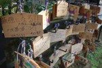
- At the shrine, worshippers write their wishes on wooden boards in hopes they will be granted.
-

- These are very large ceremonial lanterns. Small fires are lit in the top part during certain ceremonies.
-

- A detail of a dragon on top of one of the more elaborate lanterns.
-
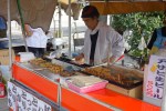
- We stopped for grilled meat at this small stand in Ueno park. Well, Amy stopped for the food, I stopped for the beer.
-
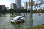
- Swan boats on the lake at the edge of Ueno park. I got tired just looking at all the peddling.
-

- There were hundreds of little birds in the trees by the Ueno park lake. People put bread in their hands and stood still and the birds flocked over. They are a blur here partly because they moved so fast, and partly because I forgot the concept of ‘shutter priority.’
-

- The main shopping street near Ueno station. As a rule, the most fun you will have is anywhere near the train tracks (seen elevated, upper right). Amy wades through will I take the photo.
-

- Matcha (green tea) swirlie. This shop in Ueno sold tea and tea accessories (they take tea very seriously), including green tea ice cream.
-

- Mascots! I have no idea what this one was promoting, but when I see a big-headed mascot I must try to get a photo. There are more here than you’d imagine. Amy is attempting the cool Tokyo ‘pose,’ generally some variation on the peace sign. Nobody takes a picture here without a go-to ‘move.’ Kind of like ‘Blue Steel’ or ‘Magnum.’
-
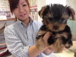
- When puppies attack. This little cutie has a temporary home in the pet shop in Hiroo. I must admit, I go in almost every time I walk by.
-

- More puppies. These guys were conked out. The spotted, long-haired dachshund was using the other fluff ball for a pillow. I’ve only seen the long-haired variety here, and I must say they are very cute.
-

- Pardon the fuzzy shot (zoomed iPhone). Not sure what business the van’s sign is promoting, but the dog in the front seat was a fairly large poodle with hair cut to look like a lion. Very funny.
-

- The view from the top of the ANA Intercontinental Hotel. We were there for a very special Champagne dinner. Tokyo Tower is lit up in the distance.
-

- The best burgers we’ve found so far only a 15-minute walk in Aoyama. Big and juicy with lots of pepper. I ordered the large beer last time and it was enormous at a reasonable price, which doesn’t hurt.
-

- We hate wine…you can totally tell. This was a wine tasting at the club involving ‘value’ wines. Four whites, eight reds, one beer, dinner, and the subway home. One of the benefits of never having to drive in Tokyo.

You must be logged in to post a comment.